How To Make WooCommerce Affiliate Program Pages Shine (SliceWP Tutorial)
I’ve gone all out on SliceWP, haven’t I? Chances are you’re here after reading my guide on creating an affiliate program for WordPress using
I thought I’d give you some quick vital tips on how I would do things when it comes to setting up an affiliate program for your online store.
What Would I Do With Affiliate Pages?
I mean, the Affiliate Registration page, the Affiliate Account page, and the Affiliate Login page. All these pages
These are tips, and you don’t have to follow my way of thinking, I’m merely telling you a few different ways of doing things.
Condense Affiliate Pages
Essentially I renamed the Affiliate Registration page to Become An Affiliate and changed the URL. So I ended up with the below:
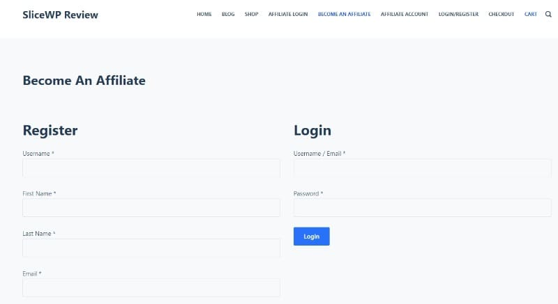
Making the Register/Login Page Stand Out
I’m not using either or any page builder, save for the block editor (Gutenberg). I want to make these stand out a little more, so how do you do that?
It’s a lot easier than you think. First of all, on the page I’ve created for logging in/becoming an affiliate, I’ve highlighted a column.

Under Additional CSS class(es) highlighted by the red box above, I’ve given this particular column a class of affbox. By doing this, I can then add some styling to the box via CSS.
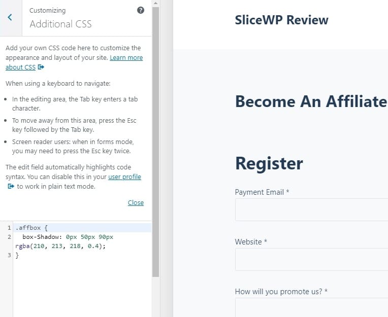
Once there you’ll need to add some code, I want a subtle box-shadow around mine to make it stand out more. Using the following code, a box-shadow will be applied to this column, the code is as below:
.affbox {
	box-Shadow: 0px 50px 90px rgba(210, 213, 218, 0.4);
}
See below for what it looks like, kudos points to those who notice somethings wrong:

Doesn’t stand out enough, am I right? Plus, there’s no spacing around the box, so the text and fields, melt into the border. The color? Well, it’s dull as ditch-water. Easy to fix!
All you’ll need to do here is add some additional CSS:
.affbox {
	box-Shadow: 0px 50px 90px rgba(210, 213, 218, 0.4);
	background-color: #fff;
	padding: 25px;
}
Note the addition of padding: 25px; this puts some space between the edges of our affiliate boxes, meaning they should not bleed into the sides.
I’ve also added, background-color: #fff (white), which means the boxes should have a white background to them, let’s save and take a look at it:
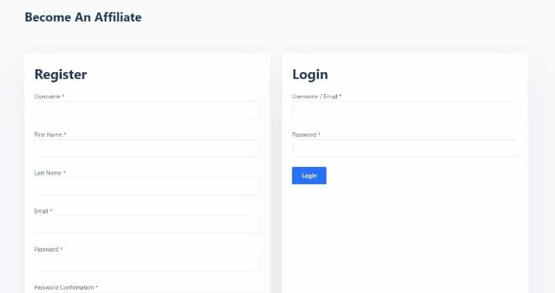
Yes! Much, much better. There’s still an issue though, note the amount of white space on the login box?
That’s due to the amount of information the registration field requires compared to the login box. Another easy fix!
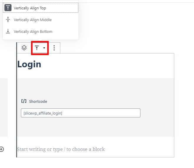
Click on the bar with the arrow underneath and select Vertically Align Top. Save the page, see below for what happens:

Excellent, our Become An Affiliate page (or whatever you decide to call yours) with the SliceWP shortcodes, and a dash of CSS, looks all the better.
Making an Affiliate Landing Page to Promote Your Program
In my guide on setting up an affiliate program and adding users manually, I talk about this as I know some people may not be ready, and affiliate programs can take time to build up.
If you’re at the point where your affiliate program has a good number of people using it, and you want to actively push it on your site, what do you do?
I’m not going to show you how to use Elementor or your page builder of choice, no point, if you use it already, you’ll know how to style sections and such.
In truth, showing you how to build an affiliate program page to attract affiliates may not work, my design and method may not be suitable for your needs.
I can; however, show you some examples of affiliate program pages that work and some that don’t and give you the reasons why.
Ready? Let’s go!
Examples of Bad Affiliate Landing Pages
Let’s start with the wrong; its always a good thing to point out the bad first, so you don’t make mistakes.
I’ve cherry-picked a range of affiliate landing pages from various sites, and I’ll list why they don’t work from a potential affiliate perspective.
Boohoo Affiliate Landing Page
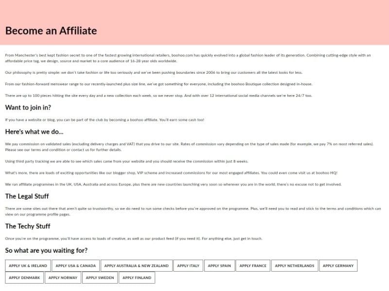
Why It’s Bad
- Too much text.
- No images.
- No inclination as to how much an affiliate could generate through working with them.
- Call to action seems muddled.
- No FAQ.
- No mention of cookie life.
Walmart Affiliate Landing Page
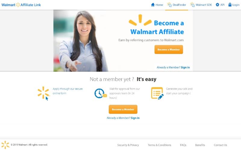
Why It’s Good
- Image (if only one).
- Calls to action (buttons).
Why It’s Bad
- No indication of commissions.
- Scant information.
- No FAQ.
- No mention of cookie life.
Example of a Good (Excellent) Affiliate Landing Page
You’ve heard the adage, less is more. While that may be true in some circumstances, when it comes to affiliate landing pages, they need info.
Essential criteria:
- What commission percentage will I earn?
- How easy is it to become an affiliate?
- What do I need to do to become an affiliate?
- How long does the affiliate cookie last?
- When do I get paid?
- What payment methods are offered?
The affiliate page is long(ish) for Kinsta’s program, that said, I’m going to break it down for you.
Answering An Affiliate Question Right Off The Bat
Please don’t get me wrong; affiliates aren’t greedy. They need answers to questions, capture their attention? Well, they’re in the palm of your hand. Take a look below to see how
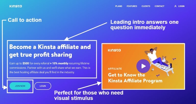
From a first time visit, they have it nailed. Putting on an affiliate thinking cap on for a second, what’s going to grab my attention?
Well, the Allure of $500.00 Has Me Intrigued.
I’ll click on the Join Now button, then shall I? No. If I were in charge of this program, I’d make affiliates work for it a little more.
Clicking on the Join Now button takes you to the affiliate registration page, which is fine and dandy.
I’m sure they get a sh*t load of signups, a way to coax out the waste of time affiliates (you will get those) I’d have made the button scroll to the next section. Why?
To ask why you need to ascertain more details. If your WooCommerce affiliate program is going to survive, you need to attract quality affiliates.
The immediacy of this call to action is fantastic, don’t get me wrong. There’s a problem with it, though.
Many will see the $500.00 wording and apply willy nilly. Which means you’ll have a load of signups, which eats into your time.
As an online store owner, your time (I have mentioned this elsewhere) is precious. Why waste time with affiliates that see the $500, nothing else?
It’s like a red rag to a bull.
In fairness, you don’t need these kinds of affiliates. They’ll never amount to anything. Here’s why:
- They see $500, that’s all. They don’t see the long game.
- They are after a quick buck.
- Quick buck = poor content (reflects badly on you).
- Poor content = lack of trust (reflects badly on you).
- Lack of trust = no sales, for them or you.
- Everyone loses.
If I were in charge of the Kinsta affiliate program, I would have changed the text on the call to action button, from Join Now to Know More.
Why?
It’s a leading question. Visitors to this affiliate landing page would like to know more. Knowing more addresses suitability, addressing suitability eliminates the time-wasters (their time and yours), giving more info is crucial.
The next section (remember I’m inspiring you here, talking from an affiliate POV) is a killer and addresses a few questions that may arise—negating the need for a contact request.
See below:
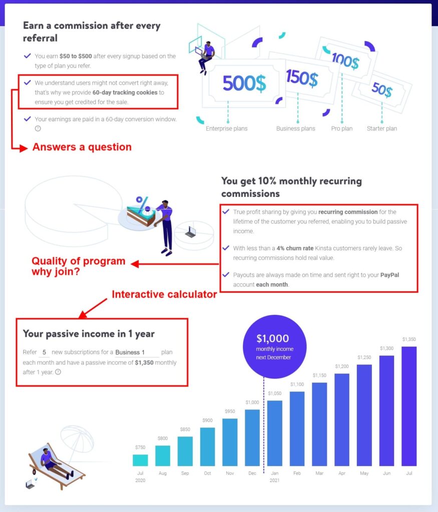
Why scroll to this section? If I were an affiliate (a credible one, there are some rotten eggs out there), I’d like to know what’s in it for me.
Let’s break it down. This section answers a few questions, by answering questions as an affiliate we’re better informed.
- How much could I potentially earn? Answered.
- Cookie life duration addressed. 60 days? Wow, that’s generous!
- Earnings are paid in a 60-day conversion window. Answers the question.
- Recurring commissions, that’s attractive!
- A churn rate of less than 4%, wow!
- Payments are made on time via PayPal, answers the question of what payout methods are used.
Kinsta gets fancy here, with an interactive calculator to see how much you could make overtime referring visitors and what plan they take up.
I’m not saying you need to do this for your WooCommerce affiliate program, and it could be a real ball ache. As an affiliate? It stands out.
Clear Instruction
Below the calculator is some key steps, and they offer clear instruction. How to get started, Sign up, Generate your links, Earn money.
Powerful, simple, and clear. Each step has a description detailed in a small paragraph.

Helping Affiliates
This last section deals with ways to help affiliates earn more. Don’t forget to them you are effectively a member of their marketing team; as a result, they want to offer you as much help as they can to sell more.
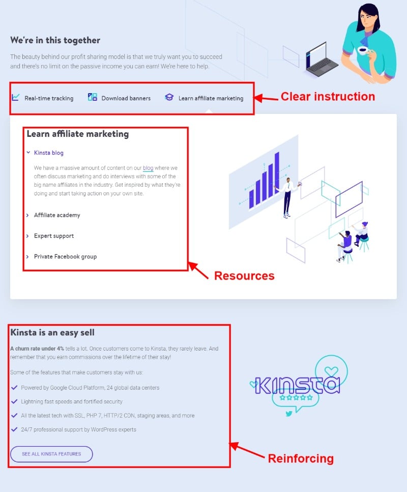
You make money, ultimately they do. Kinsta has gone to town on this, with a positive message of “We’re in this together” and stating they are here to help.
Tabbed content offers a look at Real-time tracking (excellent for affiliates to see how they are getting on), assets for members to use in content, and lastly, Learn affiliate marketing.
Here affiliates can learn more about affiliate marketing via Kinsta’s blog, their academy, or their Facebook group. They are arming affiliates with a range of tried and tested means of generating revenue.
That’s how you make an affiliate landing page, one that converts.
Wrapping Things Up
Again I’m not saying you need to follow
Remember to answer questions that could be running through an affiliate’s mind, give as much info as you can without it reading like war and peace.
Add strong calls to action, add images, and add testimonials if you can. The idea of your affiliate landing page is to attract affiliates, and they are your marketing team, helping them with a quality affiliate page and an attractive affiliate program, and you’ll do very well indeed.
Subscribe To My Newsletter
Read it? Share it!
Leave a Reply